Miles Driven vs. Gas Prices
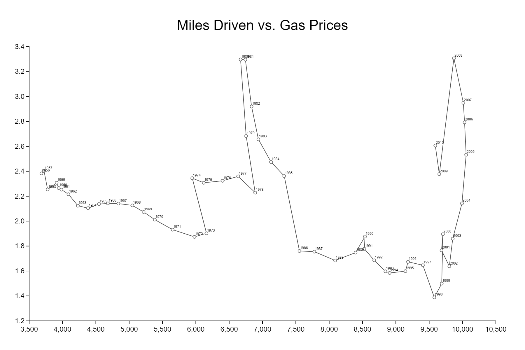
This chart shows how the relationship between miles driven (per capita) and gasoline prices have changed over the years.
Data Source
Data is retrieved from Observable’s Connected Scatterplot, which is a recreation of Hannah Fairfield’s Driving Shifts Into Reverse.
Download Dataset (.csv)Creation Process