Polio Incidence Rates in the United States

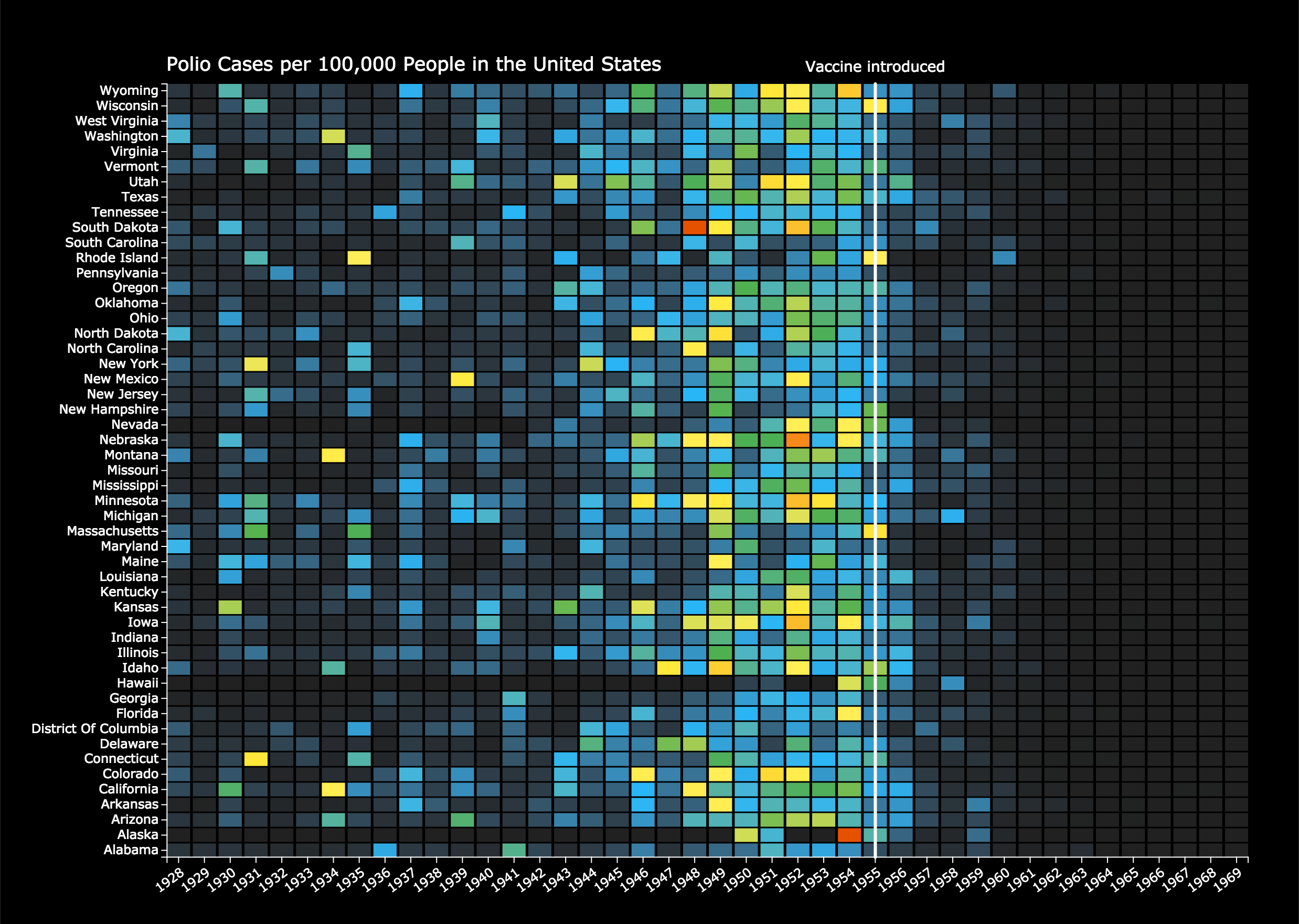
This chart displays Polio incidence rates (number of cases per 100,000 people) for each American state. The chart is a heatmap where each cell represents the incidence rate for a given year and state. The color represents the incidence rate.
Based on a chart produced by the Wall Street Journal, http://graphics.wsj.com/infectious-diseases-and-vaccines/
Data Source
Retrieved from Project Tycho; aggregated into yearly values.
Creation Process