Using in Power BI
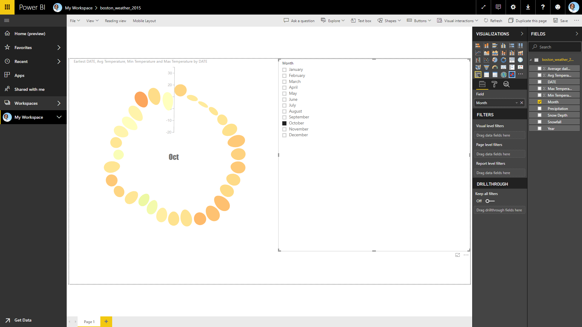
You can import the chart design, exported as a Power BI Custom Visual, into Power BI. Once its requird data fields are filled, you can see the chart within Power BI. (
) In addition, the chart reacts to the event from other charts or slicers. For example, you can create a slicer using the Month value of the
DATE value so that you can interactively choose the desired month to be shown. (
)
Charticulator’s underlying framework handles data tables in a certain way, expecting data tables are formatted in a specific way. Some of the Power BI’s default behaviors do not satisfy the expectations and cause unwanted results. Here, we explain how to configure the settings in Power BI to meet Charticulator’s expectations.
Don't Summarize
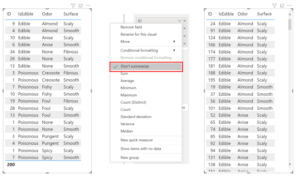
In Charticulator, a glyph represents one data row. For example, to create a bar chart, each row in the data table must correspond to one bar. On the other hand, Power BI “summarizes” data by default. For example, with the 200 mushrooms dataset, for a numerical data field (ID), Power BI automatically computes the Count, the number of rows with the same set of data values (see the left figure below). To ensure that each data row is drawn as a glyph in Charticualtor, you need to tell Power Bi not to summarize, by selecting the Don’t summarize menu item.
Data Order
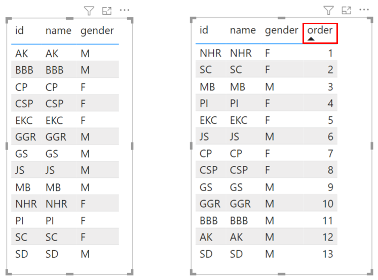
By default, Charticulator does not sort data and handles the data in the order they appear in the table. On the other hand, Power BI usually tries to order data in a predefined way (based on data values). Therefore, if you want to enforce an order that is not based on existing data values, you need to add a data field to specify order and then order the table based on that field.
Date vs. Date Hierarchy
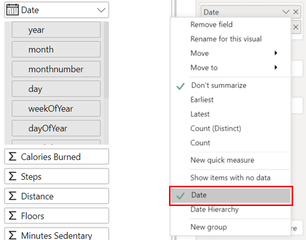
For the date type data value (e.g., “02/24/2021”), Charticulator automatically extracts its subcomponents (e.g., day, dayOfYear, weekday). On the other hand, Power BI creates a date hierarchy, consisting of Year, Quarter, Month, and Day, and uses the date hierarchy by default. Therefore, to reuse a chart design created with Charticulator in Power BI, you need to select the Date menu item.
Creating a Chart with Links
To draw a chart with the links between glyphs in Charticulator, you need two data tables: one for nodes (or entities) and another for links (or relationships) between nodes. Because Power BI visuals expects a single table, you need to create a relationship between these two tables, by following these steps:
- Select Modeling from the main menu.
- Select Manage relationships from the ribbon.
- In the Manage relationships window, select New….
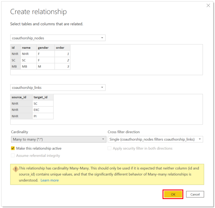
- In the Create relationship window, follow these steps:
- Select the table for nodes from the first dropdown menu.
- Select the table for links from the second dropdown menu.
- Select the id column from the table for nodes.
- Select the source_id column from the table for links.
- Select Many to many (.) from the Cardinality dropdown.
- Select OK to compete the relationship creation process.
After creating the relationship, do not forget to select both Don’t summarize and Show items with no data for all columns in the Data and Links sections.